A picture is worth a thousand words
Welcome to the v1.2 release! The introduction of the very anticipated Front-end pack has begun. v1.2 introduces 4 new components for your arsenal:
This will continue over the next MINOR releases as we begin to roll out framework optimizations, condensing of redundant components and the introduction of even more new components! Look for v-timeline, v-tree-view and even a robust v-calendar coming in the future! We are very excited to continue expanding out feature-set and hope you enjoy this new round of goodies.
If you haven't seen our new cognito vuex module, you have to check it out! @bdeo has started expanding our ecosystem offerings by providing an easy to use vuex module to interact with aws cognito. An in progress example project can be found here.
If Vuetify has helped your development in any way, please consider backing the project on Patreon. We offer tiers that are beneficial to both individuals and businesses. This helps us continue to maintain the framework and provide the level of support that we do. Thank you for using Vuetify!
📖 Table of Contents
#Important links
#TLDR
#New features
#Upgrade guide
#Release notes
#I need help!
❗️ Important links
Documentation
Community
Supporting Vuetify
Twitter
Facebook
Medium publication
Shop
⌨️ TLDR
- New components
- Updated transitions
- Improved theme propagation
- Support for custom colors when using the color prop — color="#FFFFFF"
- Numerous locales added
🚀 New features
Click to expand
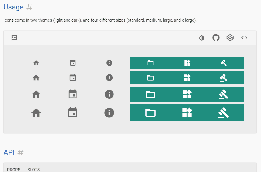
v-img
The v-img is the start of the front-end pack and a very exciting addition to the framework. @KaelWD has been working tirelessly to bring a performant and flexible component to empower your applications. As a result, the vuetify-loader has been updated to support automatic progressive images. It is easier than ever to add special transitions, aspect-ratios and so much more.
Flexible usage
v-img is part of a group we call core components and will fuel the functionality of future updates (looking at you v-parallax and v-carousel).

Loading indicators
Supply a custom loading indicator to provide a custom experience for users.
Progressive images
With the power of the vuetify-loader, your application can now be configured to automatically create progressive images for your v-img use-cases. You also have the option to provide you very own lazy loaded image until the supplied has been downloaded.

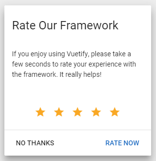
v-rating
The second new component from the front-end pack is v-rating. A simple yet powerful component packed with plenty of functionality and flexibility.
Scoped slots
With the power of scoped-slots you can fine tune specific details of the rating selections.

Information cards
The v-rating component is perfect for capturing user information or displaying user reviews.

v-hover
The v-hover component is a simple wrapper for capturing user gestures over elements/components.

v-responsive
The v-responsive component is the baseline for v-img and provides you with the ability to specify content aspect ratios.

📑 Upgrade guide
Click to expand
v-jumbotronandv-card-mediahave been deprecated in favor ofv-img- themes (dark|light) are now applied through Vue provide/inject. If you were using specific styles or workarounds to account for menu or dialog background colors, you can remove them. If you were using static markup instead of component (for example created table markup with html to display static data table) you need to manually add
theme--lightortheme--dark v-menuprops for components likev-selectandv-autocompleteare now applied through a menu-props prop
💯 Release notes
1.2.0
🚗 Things we added
- #4944 Added catalan locale
📳 Things we changed
- 44ac40d If you supply a custom height on the element wrapped by
v-expand-transition, it will now use that value instead of scrollHeight
🔧 Things we fixed
v1.2.0-beta.3
🚗 Things we added
- 719ac43 Transition components can now work on multiple elements with the group prop
- bca41c6 Added hide-on-leave and leave-absolute props to transition components
- c7c463f Added a gradient prop to
v-img - 6b8d7bb Added width and max-width prop to
v-responsiveandv-img - 5ac572b Added light and dark props to
v-list-tile - #4691 Added actions-prepend and actions-append slots to
v-data-table(thanks @DCzajkowski) - #4890 Added readonly prop to
v-time-picker - #4903 Added locale files for farsi (thanks @alireza4050)
- #4924 Added dense prop to
v-rating
📳 Things we changed
- 9f61a81
v-dialogandv-menuwill inherit their theme fromv-appinstead of the nearest parent - #4874 Converted
v-paginationto typescript - #4876 Locale files are now written in typescript.
🔧 Things we fixed
- 38880ee Removed padding from selection controls in
v-list-tile-action - 977fd7d Reduced the height of the year section in
v-date-picker - a7ffbfe Prevent content from overflowing
v-responsiveandv-imghorizontally - 93ee3c7 7d55184 Fixed theme inheritance in
v-tabs - #4460
$vnode.data.model.expressioncan be used again onv-text-fieldandv-select - #4891 Fixed
v-slidertop margin with the thumb-label prop - #4928 Fixed
v-selectcolours when usingmenu-props="light"on a dark background
v1.2.0-beta.2
🚗 Things we added
- #4865 Added a dutch translation (thanks @ricardovanlaarhoven)
📳 Things we changed
🔧 Things we fixed
v1.2.0-beta.1
🚗 Things we added
- 0ed01dd Added grid classes for
align-self,justify-self, and auto margins - 8a4b59d Added more transitions
- #4342 The color prop now takes hex and CSS colours
- #4774 New configuration options
customProperties, enables CSS variables for theme colours - #4821
v-ratingcan be reset to 0 with the clearable prop (thanks @AuspeXeu) - #4841 New helper component
v-hover, added group prop to transition components
📳 Things we changed
- 7f396e6 Made ripples look better
2d3f0da- reverted in beta.2v-btnwill always have black text unless the dark prop is used (fixes #4812)- #4795 Some
v-selectprops have been consolidated to a new menu-props prop - #4803 Updated input styles to improve vertical alignment, use
hide-detailsif they're too tall - #4804 Selection controls use native input events, enter doesn't do anything, toggle-keys has been removed
🔧 Things we fixed
- e22e24e Fixed MDI icon alignment in
v-data-table - 585798d
v-responsivewill now inherit event listeners - 7f38e4a Fixed a bug causing
lighten-5to be darker thanlighten-1 - #4775 Updated the french translation (thanks @Enhakiel)
- #4777
v-imgwill now be circular when used in av-avatar - #4856 Fixed
v-edit-dialogcolours
Includes all fixes from 1.1.10, 1.1.11, and 1.1.12
v1.2.0-beta.0
🆕 New Components
v-img- Lazy loading
- Progressive images (via vuetify-loader)
- Dynamic and static aspect ratios
v-responsive- The same aspect ratio functionality as
v-img, but without the lazy loading
- The same aspect ratio functionality as
v-rating- Great for e-commerce products and customer reviews
- Hover functionality
🚗 Things we added
- #809 Added multiple prop to
v-date-picker(thanks @motia) - #2175 Added support for nudge props on
v-tooltip - #2494 Themes (dark/light) are now applied through Vue provide/inject. Children will inherit from the first parent that provides theme or overwrite it if declared on the component
- #3316 New
v-formmethod resetValidation - #4061 Added new prepend-item and append-item slots for the
v-selectfamily (v-autocomplete,v-combobox,v-overflow-btn) - #4294 New
v-data-tableprop header-key, for multiple headers with the same text - #4408 Theme colors can now be objects, for full control over lighten/darken variations
- #4667 Components are now registered as PascalCase
- Added new locales:
- Ukrainian (thanks @iliyaZelenko)
- Polish
- Russian (thanks @Djaler)
- German (thanks @dmecke)
- Portuguese
- Greek (thanks @nkoik)
- Chinese (thanks @myleslee)
🆘 I need help!
If you are stuck and need help, don't fret! We have a very large and dedicated community that is able to provide help 24/7. Come to the #release-migration channel.