
🦊 v7.0.0 - Nova UI Edition
Important
v6.6.0 introduced several new preferences and breaking changes. If you missed its release notes, you can read them here:
New and Changed
-
Added
uc.flex.style-urlbar-gradientto apply the sidebar stripe gradient to URL bar elements:0 = Disabled (default) 1 = Gradient icons 2 = Gradient icons and an animated gradient border on hover 3 = Gradient icons, an animated gradient border on hover, and gradient URL textThe gradient colors follow
uc.flex.style-sidebar-stripe-color. Text dimming differs between Firefox 155 and 156 because of Bug 2063127. For a fully undimmed gradient text effect, create the nativebrowser.urlbar.formatting.enabledpreference and set it tofalse.
Preview settings:
uc.flex.style-urlbar-gradient = 3 uc.flex.style-sidebar-stripe-color = 9 -
Added
uc.flex.style-tab-items-border-widthto set the active-tab border width:0 = No border 1 = 1px border (previous default) 2 = 2px border (default) -
Added
uc.flex.style-tab-items-gradient-borderto control the gradient border on the active tab:0 = Disabled (previous default) 1 = Static gradient (default) 2 = Animated gradientThe gradient colors follow
uc.flex.style-sidebar-stripe-color. A static gradient is the Nova UI default and is enabled by default in FlexFox ahead of the rollout because of Issue #41. This option has no effect whenuc.flex.style-tab-items-border-widthis set to0.
Preview settings:
uc.flex.style-tab-items-gradient-border = 2 uc.flex.style-tab-items-background-fill = 0 -
Expanded the value range of
uc.flex.style-tab-itemsto0-2to control the appearance of pinned tabs:0 = No border or background fill 1 = Border only (default) 2 = Background fill onlyBorders and fills use neutral colors in Light Mode and the sidebar stripe accent color in Dark Mode. With value
2, selected-tab borders always use the accent color. -
Added
uc.flex.style-tab-items-background-fillto control tab background fills:0 = Transparent active-tab background 1 = Accent-colored active-tab background (default) 2 = Add a neutral base background fill to all tabsEnabling
uc.flex.style-tab-itemsoverrides the base background of pinned tabs. When this option anduc.flex.style-tab-items-border-widthare both set to0, a 1px border is retained.
Preview setting:
uc.flex.style-tab-items-background-fill = 2 -
Added
uc.flex.style-tab-items-gradient-backgroundto control the gradient background on the active tab:0 = Disabled (default) 1 = Static gradient 2 = Animated gradientIt can be used together with a gradient border. This setting overrides
uc.flex.style-tab-items-background-fill.
Preview settings:
uc.flex.style-tab-items-gradient-background = 2 uc.flex.style-tab-items-border-width = 0 -
Expanded
uc.flex.show-tab-close-button-on-favicon-hoverto support Native Vertical Tabs and Sidebery in addition to native horizontal tabs. It merges the close button into the favicon and shows it when hovering over the favicon. -
Added
uc.flex.style-tab-close-button-warning-zone-sizeto control the visibility and size of the warning zone inside tab close buttons:0 = Hidden (native appearance) 1 = Small (default) 2 = LargeWhen
uc.flex.show-tab-close-button-on-favicon-hoveris enabled, value2has no effect and the warning zone uses the default size (1). -
Added
uc.flex.style-tab-items-border-radiusto control whether tab items use Proton UI or the larger Nova UI corners:0 = Automatic (default). Uses Nova UI corners when browser.nova.enabled = true 1 = Force Proton UI corners 2 = Force Nova UI cornersThe "List All Tabs" button placed on the horizontal tab bar also follows this setting.
Preview settings:
uc.flex.style-tab-items = 0 uc.flex.style-tab-close-button-warning-zone-size = 1 -
Added
uc.flex.style-toolbar-items-border-radiusto control whether toolbar buttons, panel items, menu items, bookmark menu items, the upper outer corner of an expanded sidebar, the sidebar stripe, and the findbar use Proton UI or the larger Nova UI corners:0 = Automatic (default). Uses Nova UI corners when browser.nova.enabled = true 1 = Force Proton UI corners 2 = Force Nova UI cornersuc.flex.revert-to-original-flat-corner-styleoverrides both border-radius preferences.
Improvements
-

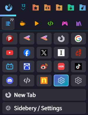
Refined the whitespace and spacing in the pinned-tab grid for a less crowded and more balanced appearance.
-
Added a rounded outline to the findbar, giving it a floating appearance that separates it from the web content background.

-
Added the placeholder "Type
uc.flexto show all FlexFox preferences" to the emptyabout:configsearch field.
-
Extended the sidebar stripe accent colors to horizontal tabs, which can now use the same border and background colors as vertical tabs.
-
Improved the gradient rendering of title text on Sidebery Group Pages so the full text uses the gradient regardless of its length.

Breaking Changes
-
Renamed the
uc.flex.skip-loading-uc-*.csspreferences touc.flex.~dev-skip-loading-uc-*.css.These preferences skip loading specific CSS files to help isolate components during troubleshooting. The old names were sorted among regular options in
about:config, which could misalign their descriptions. The new namespace sorts them after the regular options, allowing new development preferences to be added without disrupting the layout.
Fixes
- Fixed multiple styling and layout regressions caused by Firefox updates: Bug 2049244, Bug 2055840, Bug 2046942, Bug 2033583, Bug 2044711, Bug 2045752, Bug 2054481, Bug 2023711, Bug 2022975, Bug 2052608, Bug 2034495, Bug 2029183, Bug 2046646, Bug 2039721, Bug 2047784, Bug 1998985, and Bug 2063294.