
Tabler 1.7 is out. It brings maps: an interactive map drawn by MapLibre and a vector world map that needs no map library. There's also a nav that moves its overflow into a More menu, a number input with buttons, five new components for images and text, list group items with slots, CSS variables for every form control and a new set of 304 flags. Buttons and dark mode got a round of polish too. On top of that there are more than forty smaller changes across the framework, the demo pages and the docs.
Maps
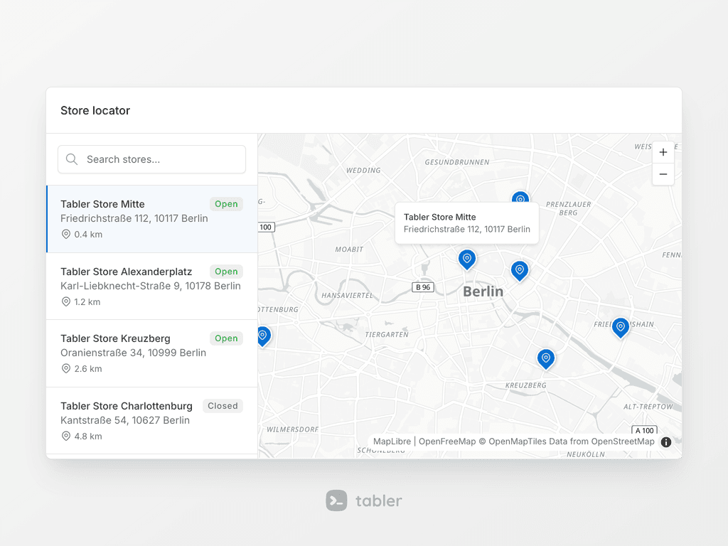
An interactive map from plain HTML, for a store locator, a delivery tracker or a dashboard of live users. Add data-bs-toggle="map" to an element, set the center and the zoom with data attributes, and every child with data-bs-lng and data-bs-lat becomes a .map-marker: a circle, a dot or a pin, with an icon, a count or an avatar inside, and a popup on click. data-bs-route draws a path with progress, data-bs-geojson draws areas and data-bs-globe turns the map into a 3D globe. The map is rendered by MapLibre GL JS with free tiles from OpenFreeMap, so it needs no account and no access token, and it follows dark mode. The component ships as a small add-on, tabler-map.js, and replaces the Mapbox and Google Maps demos.
Vector map
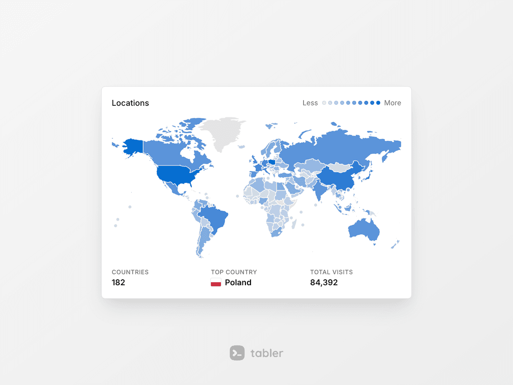
A world map drawn as inline SVG, for a number per country, a few places or routes between them. Add data-bs-toggle="vector-map" to a .vector-map element and pass the values in data-bs-values, keyed by ISO code. The country with the highest value gets the full color and the others a lighter shade, and data-bs-colors gives a scale of several colors with a legend. Markers, dashed lines, tooltips, zoom and selection come from data attributes too. It needs no map library, no API key and no network request. The plugin ships as tabler-vector-map.js with the world data in maps/world.js.
Nav overflow
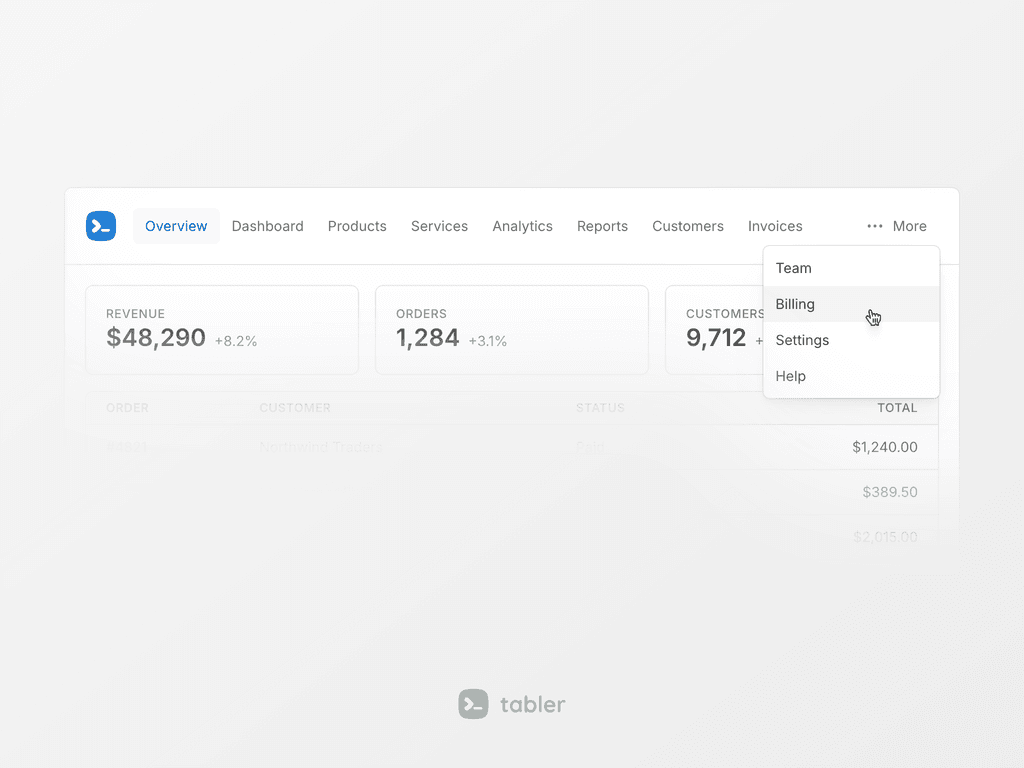
Keeps a nav on one line. Items that don't fit move into a More dropdown at the end and come back when there's room again. Wrap the .nav in a .nav-overflow element with data-bs-toggle="nav-overflow". It watches the wrapper, not the window, so it works in a card or a sidebar too. Mark an item with .nav-overflow-keep to keep it out of the menu. The demo navbar uses it now.
Number input
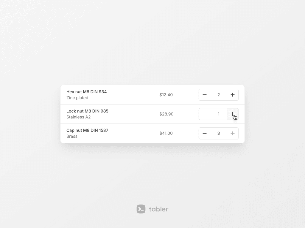
A number field between a decrease and an increase button, for a quantity in a cart or a number of seats. Add data-bs-toggle="number-input" to an input and the buttons are added for you. It keeps the value within min and max, rounds it to step, repeats while a button is held and works with the arrow keys. The input stays the only field the form sees, and every change fires change.bs.numberInput.
Hover gallery
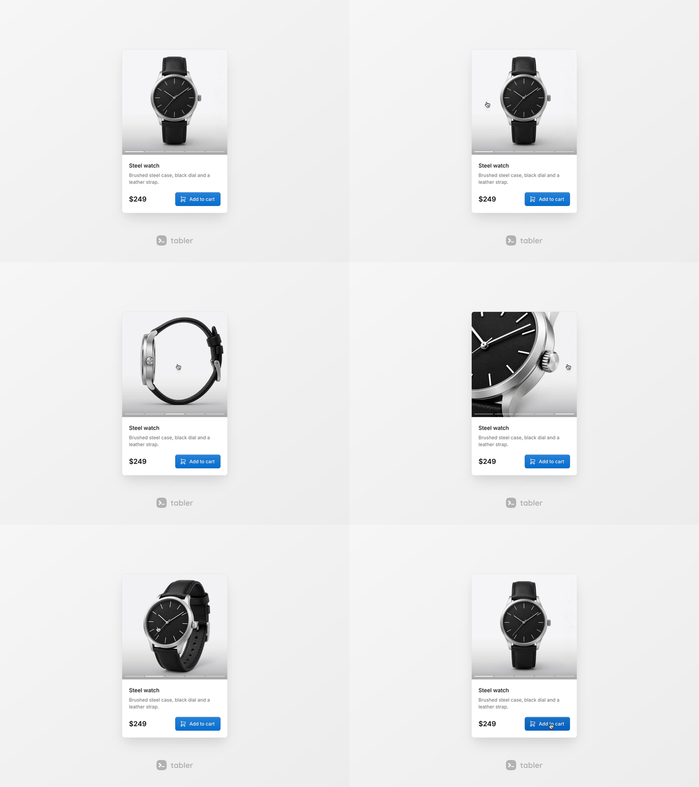
Several images in the space of one, for product cards, portfolios and listings. The image changes as the pointer moves across .hover-gallery, and .hover-gallery-indicators show which one is on. It needs no JavaScript. On touch screens it turns into a strip you swipe.
Image label
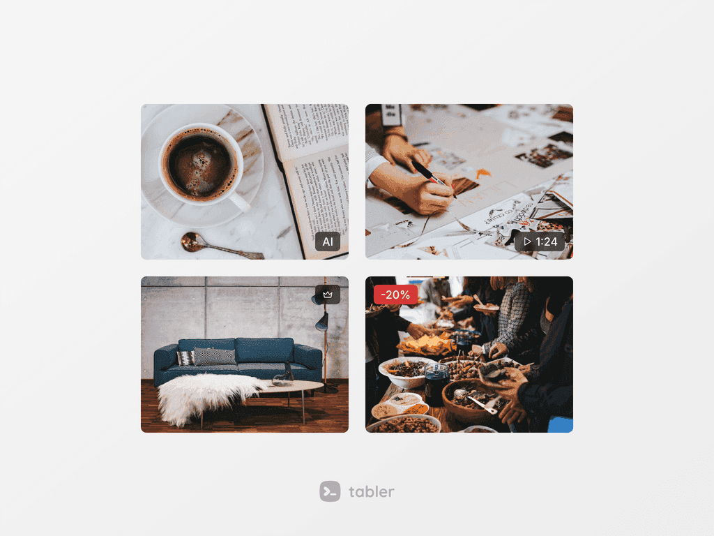
A short text or an icon pinned to a corner of an image, such as "New", "AI" or a video length. Put .img-label inside an .img-labeled wrapper, and move it with .img-label-top-start, .img-label-top-end or .img-label-bottom-start. The corners follow the text direction, so they swap in RTL.
Mockup browser
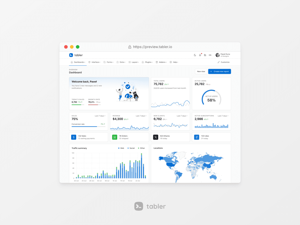
A frame that looks like a browser window, with the window dots and an address bar, for a page preview or a screenshot. .mockup-browser holds a .mockup-browser-toolbar and a .mockup-browser-body, and an image in the body fills the frame. The address bar is optional, and there's a small size.
Icon list
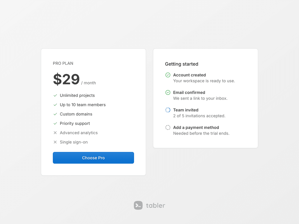
A list with icons instead of bullets, for the features of a plan or the steps of a setup. Add .list-icon to the list and start each entry with an icon. The first icon becomes the marker, centered on the first line. Color all markers with --tblr-list-icon-color, or one of them with a text-{color} class on the icon, and use .list-icon-inline for short entries in a row.
List group slots
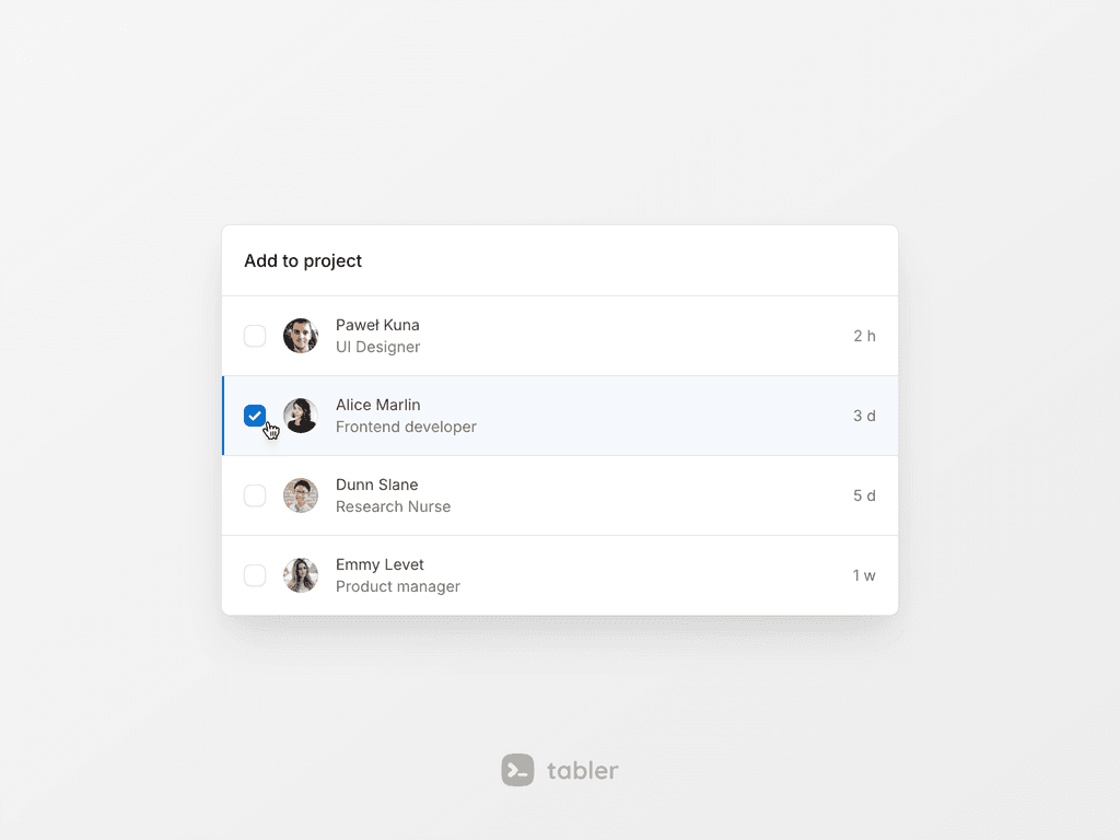
A list group item can now be a row of slots: list-group-item-media, list-group-item-content with a title and a description, list-group-item-meta and list-group-item-actions. Add .list-group-selectable and a checked input marks its row as active without JavaScript. Items can also be nested under a parent with .list-group-nested, and the list comes in .list-group-sm and .list-group-lg sizes.
Text shimmer
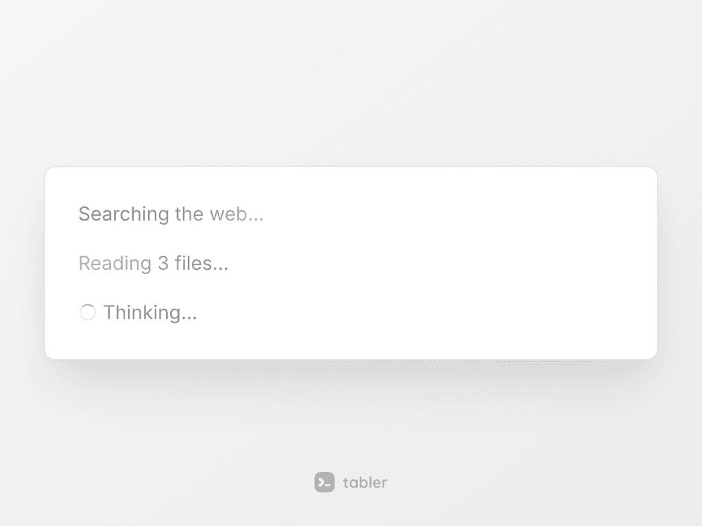
A band of light that sweeps across a label such as "Thinking…" while an agent works or a task runs. Add .text-shimmer to the label. It's a mask, so the text keeps its own color, and .text-shimmer-loader adds a small spinner in front.
Keyboard keys
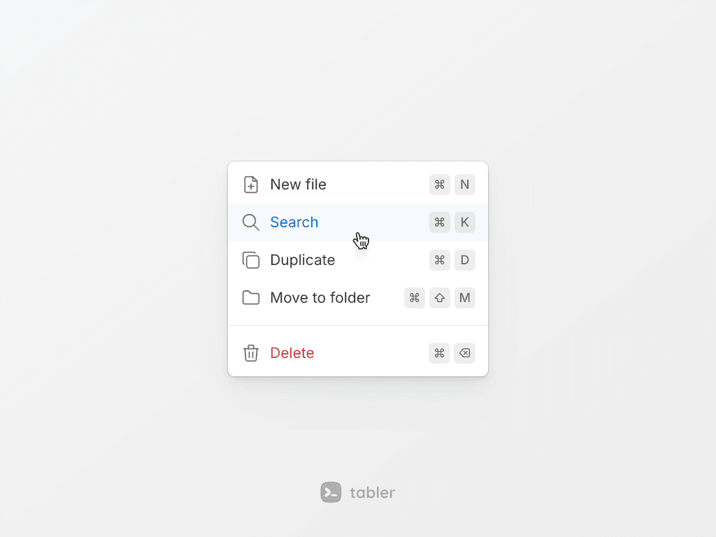
<kbd> looks like a compact key cap now, and the .kbd class gives the same look to any element. Wrap the keys of one shortcut in .kbd-group to keep them on one line with an even gap. Inside a button or a tooltip a key takes the color of the text around it, and the look is set with --tblr-kbd-* variables.
Flags
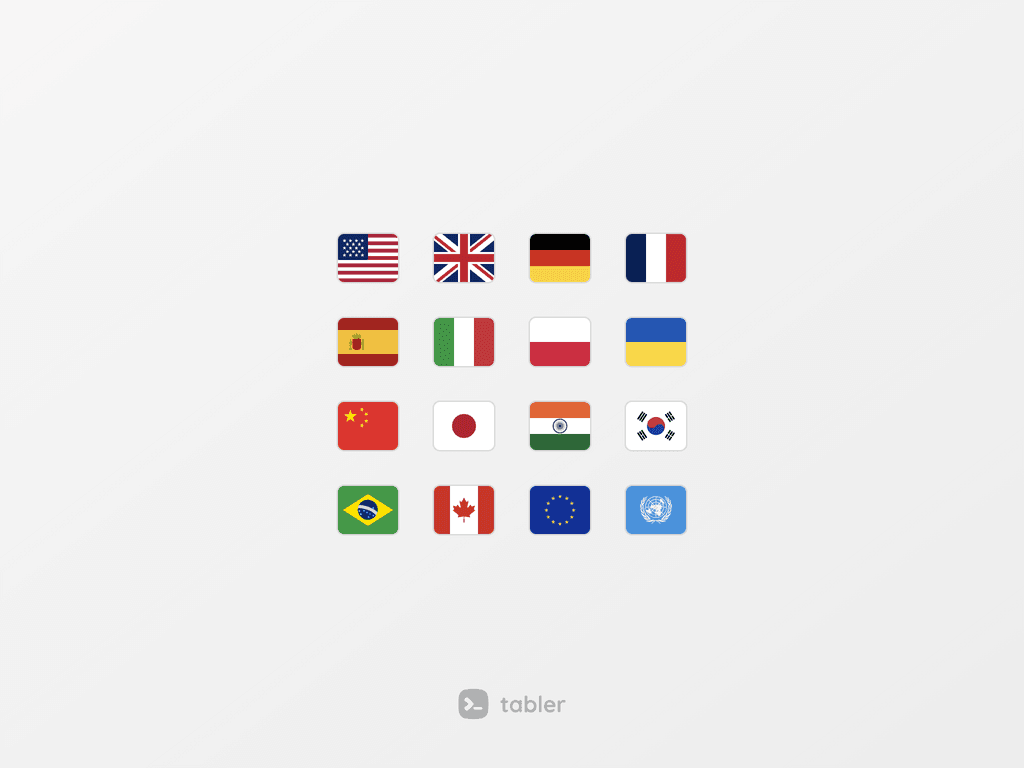
The flags plugin now ships the flags from Tabler Flags: 304 country, territory and organisation flags, 50 of them new, such as .flag-country-nato. The class is still .flag-country-{code} with the ISO code, and flags without a code use a slug, such as .flag-country-european-union. The old codes keep working as aliases.
Form CSS variables
Form controls read CSS variables now. .form-control and .form-select use --tblr-control-*, and checks, switches, input group add-ons, floating labels and range inputs have their own --tblr-form-check-*, --tblr-form-switch-*, --tblr-input-group-addon-*, --tblr-form-floating-* and --tblr-range-* sets. Icon add-ons, validation icons, the OTP input and Tom Select follow them too, so one override restyles a whole form. The new Forms → CSS variables page lists every token.
The small and large selects match the inputs: .form-select-sm is 32px tall, like .form-control-sm. Input icons sit in the middle of small and large fields, and Tom Select works with .input-icon. The switch has a filled gray track when off.
Buttons and dark mode
Filled .btn-* buttons have a thin border, inner edges and a faint gradient, and outline buttons lose their shadow. The default .btn stays opaque on hover. .btn-xl is bigger, and .btn-sm has more side padding.
In dark mode, nav links, list group headers, toast headers, breadcrumbs, the footer, .input-group-text and striped tables have better contrast, and card, alert, dropdown and table borders are no longer too bright. --tblr-bg-surface-tertiary is translucent, so card headers, footers and table stripes show on dark cards. .card-table rounds only the cells in the card corners.
Four neutral fill tokens, --tblr-fill-primary to --tblr-fill-quaternary, give the translucent backgrounds of badges, avatars, code, progress and range tracks and the hover state. The .bg-fill-* utilities use them too.
Datagrid, Datepicker and themes
.datagrid-horizontal puts each label beside its value, and .datagrid-cols-{n} shows several pairs in a row. The Datepicker has a weekNumbers option, dateFormat patterns such as 'DD.MM.YYYY' or 'iso', and a boundInput option that writes ISO dates to a form field. It also no longer stays stuck closed after the calendar throws an error.
tabler-themes.css has a new mist gray palette for data-bs-theme-base, a cool gray with a blue-green tint.
Layout and forms
data-bs-navbar-position="combined" shows the vertical and the horizontal navbar at once. The vertical navbar submenu no longer paints over the user dropdown in .navbar-footer. Disabled Tom Select fields have rounded corners, and small and large ones a rounded focus ring. .nav-segmented icons follow the link color on hover.
Smaller JS and bundled libraries
tabler.js is built for ES2022 instead of ES2015, which takes about 1.5 kB off tabler.min.js after gzip. The code is checked with ESLint now. The Sass doc comments are no longer in tabler.css.
dist/libs has MapLibre GL JS 6, and tabler-vendors.css styles its popups, attribution and controls in light and dark. Dropzone, driver.js, fslightbox, FullCalendar, HugeRTE and Plyr are updated too.
Demo and docs
The demo navbar moves the links that don't fit into a More menu. The maps page has marker, popup, route, area, cluster, bubble map and globe demos, and the new Map blocks page has seven blocks, among them a store locator, a delivery tracker and a server status map. The marketing hero has a new dashboard screenshot with a dark version. Tabler Icons are at 3.49 and Tabler Illustrations at 1.18 with 11 new illustrations.
The docs have pages for every new component, a Forms → CSS variables page and an Icon design guide in the Tabler Icons section. The datagrid page has more examples.
Upgrading
Nothing in 1.7 requires a change to your markup, and every class, custom property, Sass variable and function from 1.6 is still there.
Pricing and Shape moved from tabler-marketing.css into the core tabler.css. A page that loads both files needs no change. A page that loaded only tabler-marketing.css for .pricing or .shape has to add tabler.css. If you import Sass partials one by one, scss/marketing/pricing and scss/marketing/shape are now scss/ui/pricing and scss/ui/shape.
Some things look a little different: buttons, the switch track, the small select height, a few dark mode surfaces and the flags, which are redrawn at a 5:4 ratio instead of 4:3. Check custom styles that sit close to them.
The map demos use MapLibre instead of Mapbox GL and Google Maps. This only touches the demo pages: @tabler/core never shipped those libraries.
Every change, with a before and after example, is in the Upgrade to 1.7 guide.
Core changes
- ace9a4f: Added
.datagrid-horizontaland.datagrid-cols-{n}classes and more datagrid examples and docs. - 964eb7c: Added
dateFormatpatterns such asisoorDD.MM.YYYYand aboundInputoption for ISO form values toDatepicker. - 725e45d: Added the
weekNumbersoption toDatepickerto show the week number in front of each row. - 0647af1: Added the
--tblr-fill-*tokens and.bg-fill-*utilities, used by badges, avatars, code, progress and range tracks and the hover background. - 8f00eab: Added
--tblr-form-check-*and--tblr-form-switch-*variables, with shared--tblr-control-checked-bgand disabled tokens on:root. - 8f00eab: Added
--tblr-control-*variables to.form-controland.form-select; sizes and the file button now follow them. - 8f00eab: Updated icon addons, select groups,
.col-form-label, validation icons, OTP and Tom Select to read the--tblr-control-*and--tblr-btn-input-*variables. - 8f00eab: Updated
.form-select-sm,.form-select-lgand small Tom Select to match.form-control-*, so small controls are now 32px tall. - bb60211: Updated
.form-switchwith a filled gray off track, a white knob with an even gap and a new$form-switch-bgvariable. - f7c848a: Added the Hover gallery component with
.hover-gallery,.hover-gallery-itemand.hover-gallery-indicatorsclasses. - c493436: Added the
.list-iconcomponent for lists with icon markers, with.list-icon-inlinefor entries in a row. - 681b6eb: Added the image label component:
.img-labeledand.img-labelpin a short text or an icon to a corner of an image. - 68da446: Updated the flags plugin to Tabler Flags: 304 flags at a 5:4 ratio, 50 new like
.flag-country-nato, old codes kept as aliases. - 8f00eab: Added
--tblr-input-group-addon-*,--tblr-form-floating-*and--tblr-range-*variables to input groups, floating labels and range inputs. - 03e2775: Updated
<kbd>to a compact key cap and added.kbd-groupand--tblr-kbd-*variables for keyboard shortcuts. - 69c1114: Added item slots,
.list-group-smand.list-group-lgsizes, selectable and nested items to the list group. - a845ab0: Added
.map-markerwith dot, pin, pulse and color variants,.map-popup-card,.map-tooltipand MapLibre styles intabler-vendors.css. - a845ab0: Added the
MapViewcomponent intabler-map.json MapLibre GL JS 6:data-bs-toggle="map"makes a themed map with markers, popups, routes and a globe. - d6cfffb: Added the
.mockup-browsercomponent that frames a screenshot or any content in a browser window with an address bar. - 6c46d55: Added
NavOverflowcomponent that moves nav items that do not fit into a More dropdown, with a.nav-overflowwrapper. - 86388e4: Added
combinedas adata-bs-navbar-positionvalue to show both navbars at once. - 3f3aae9: Added the
NumberInputcomponent, a.number-inputquantity input with buttons, bounds, hold-to-repeat and keyboard support. - 12c045f: Updated
.pricingto ship in the coretabler.cssbundle instead oftabler-marketing.css. - 28c24bf: Updated
.shapeto ship in the coretabler.cssbundle instead oftabler-marketing.css. - 744f9fe: Added the
.text-shimmerclass that sweeps a highlight across a label, with an optional.text-shimmer-loaderspinner. - 5cbc443: Added a
mistgray palette fordata-bs-theme-baseand removed the hiddenpinkbase fromtabler-themes.css. - 00746f2: Added
.input-iconsupport for Tom Select: a leading icon no longer overlaps the selected value. - 8ab6441: Added the
VectorMapplugin: an SVG world map with values, color scales, a legend, markers, lines, selection, tooltips and zoom. - d75c5d6: Updated
--tblr-bg-surface-tertiaryto a translucent color, so card headers, footers and table stripes show on dark cards. - 9368b8e: Fixed the default
.btnturning see-through on hover and active by mixing the tint over--tblr-bg-surface. - b168be1: Updated filled
.btn-*variants with a subtle border, inner edges and a faint gradient; outline buttons lose their shadow. - b168be1: Updated
.btn-xlwith a1.25remfont,1.75remicons and a larger radius;.btn-smgets0.75remside padding. - e3739a1: Fixed
.card-tablerounding the outer cells of every row: only the cells in the card corners are rounded now. - 6394af0: Added ESLint with
typescript-eslintand fixed its findings inDatepicker,Dropdown,TooltipandSparkline. - 3275bff: Fixed
$border-color-translucent-darkoverbrightening card, alert, dropdown and table borders in dark mode. - d75c5d6: Fixed dark mode contrast of nav links, list group headers, toast headers, breadcrumbs, the footer,
.form-control-lightand.form-help. - a1b46ae: Fixed
Datepickergetting stuck closed after the calendar plugin throws inshow()orhide(). - d75c5d6: Fixed
.input-group-textcontrast in dark mode with the--tblr-secondary-colortext color and a translucent background. - dcacb65: Fixed
.table-stripedrows andthead thbackgrounds that were invisible in dark mode on cards. - 462835f: Fixed the square corners of disabled Tom Select fields and the square focus ring of small and large ones.
- 9d837ea: Fixed
.input-iconicons off-center in small and large inputs and selects: the addon follows the control size. - 252c914: Updated the
tabler.jsbuild target from ES2015 to ES2022, makingtabler.min.jsabout 1.5 kB smaller (gzip). - 9fb6930: Fixed the vertical navbar submenu painting over the
.navbar-footeruser dropdown. - 252c914: Removed Sass doc comments from
tabler.cssandtabler.rtl.cssby switching them to//comments. - 530f11b: Fixed
.nav-segmentedicons staying gray on hover: they follow the link color like the text. - 2726bc4: Updated the
tabler.min.jsminification to two terser compress passes. - fbf2bdb: Updated bundled
dropzoneto v6.3.5,driver.jsto v1.10.1,fslightboxto v3.8.0,fullcalendarto v6.1.22,hugerteto v1.0.14 andplyrto v3.8.5.
Demo changes
- a845ab0: Added the maps page demos on MapLibre instead of Mapbox GL and Google Maps, and the Map blocks page with seven blocks such as a store locator.
- ba4e87a: Added
.icon-inlineto icons that sit in a line of text in the demo cards, preview pages and docs examples. - 64e290b: Updated the dashboard screenshot in the marketing hero and added a dark theme version.
- ed41f04: Updated the promo top banner to load only on production deploys, not on branch previews.
- b1aac09: Updated Tabler Illustrations to v1.18.0 with 11 new illustrations.
- 8dc1ffe: Updated Tabler Icons to v3.49.0.
Docs changes
- 6cd45d0: Added the Icon design guide page to the Tabler Icons docs, with the SVG format, naming rules and icon requests.
- 8f00eab: Added the Forms → CSS variables page: the control scale, state colors and every
--tblr-control-*, add-on, floating, range, check and switch token. - d07533c: Updated the 1.7 upgrade guide with the visual changes, the Shape menu entry,
combinednavbar position, flag aliases and--tblr-kbd-*variables.