Highlights
Custom window decorations
Custom window decorations (Windows 10 only) support dark window title panes and embedding menu bar into window title pane.
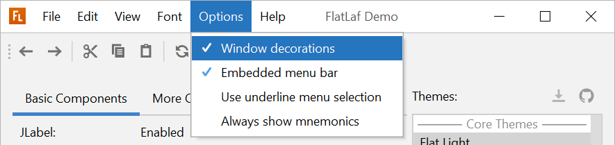


Native Windows 10 borders and behavior are used when running in JetBrains Runtime 11 or later (the JRE that IntelliJ IDEA uses):

To use custom window decorations in your application, enable them with following code (before creating any frames or dialogs).
JFrame.setDefaultLookAndFeelDecorated( true );
JDialog.setDefaultLookAndFeelDecorated( true );
Then, if running on Windows 10, custom window decorations are used and the menu bar is automatically moved into the title pane. On other platforms or older Windows versions, the custom window decorations are not used.
Filled check boxes and radio buttons
It is now easy to use "filled" style check boxes and radio buttons in any FlatLaf theme (as already used in IntelliJ theme):

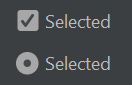
Enable with:
UIManager.put( "CheckBox.icon.style", "filled" );Change log
- Custom window decorations (Windows 10 only; PR #108; issues #47 and #82)
support:- dark window title panes
- embedding menu bar into window title pane
- native Windows 10 borders and behavior when running in
JetBrains Runtime 11
or later (the JRE that IntelliJ IDEA uses)
- CheckBox and RadioButton: Support changing selected icon style from outline to
filled (as in FlatLaf IntelliJ theme) withUIManager.put( "CheckBox.icon.style", "filled" );. - Button and ToggleButton: Support disabled background color (use UI values
Button.disabledBackgroundandToggleButton.disabledBackground). (issue
#112) - Button and ToggleButton: Support making buttons square (set client property
JButton.squareSizetotrue). (issue #118) - ScrollBar: Support pressed track, thumb and button colors (use UI values
ScrollBar.pressedTrackColor,ScrollBar.pressedThumbColorand
ScrollBar.pressedButtonBackground). (issue #115) - ComboBox: Support changing arrow button style (set UI value
ComboBox.buttonStyletoauto(default),buttonornone). (issue #114) - Spinner: Support changing arrows button style (set UI value
Spinner.buttonStyletobutton(default) ornone). - TableHeader: Support top/bottom/left positioned sort arrow when using
Glazed Lists. (issue #113) - Button, CheckBox, RadioButton and ToggleButton: Do not paint focus indicator
ifAbstractButton.isFocusPainted()returnsfalse. - ComboBox: Increase maximum row count of popup list to 20 (was 8). Set UI value
ComboBox.maximumRowCountto any integer to use a different value. - Fixed/improved vertical position of text when scaled on HiDPI screens on
Windows. - IntelliJ Themes: Updated Gradianto Themes.
- IntelliJ Themes: Fixed menu bar and menu item margins in all Material UI Lite
themes.